D3 Visualizations
November 2018
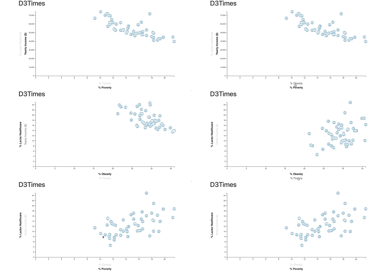
The US Census provides much useful information, so it can be useful to plot several variables against each other in the same plot. I used d3.js to do just that, plotting poverty rate, obesity rate, percentage of people without healthcare, and yearly income on one chart for easy comparison. This required use of d3 transitions and custom tooltips.
